
Finding the Best Metro Routes
for Travel Plans (end to end)
February 2024

SUMMARY
As part of a one-week design challenge, I collaborated with a Senior UX Designer to create a user-centric app for navigating the Delhi Metro. With no predefined problem, we explored real commuter pain points, analysed existing solutions, and focused on simplifying route planning. Given the metro’s vast network and diverse users, we prioritised key issues to deliver a meaningful, time-efficient solution.
ROLE
I mainly supported ideation and UI design as an Associate UX Designer, along with a Senior UX Designer
TOOLS
Figma
How might we help users quickly find the best metro routes with less confusion and effort?
Metro commuters often struggle to find the most efficient and convenient routes tailored to their travel plans due to complex schedules, a lack of real-time updates, and unclear navigation within metro systems. This creates frustration and delays, especially for new or occasional users.
Pricing Information
Addressing the challenge of variable pricing across different routes and user groups.
Complexity of Metro Network
Multiple lines and stations add
complexity of route planning andreal-time information display.
Real-Time Data Integration
Providing real-time updates on
train status and crowdedness
levels is essential but challenging.
and why is it important?
To enhance the commuting experience for metro users in Delhi by providing accurate, real-time information and route optimization, encouraging more people to use public transportation and supporting urban mobility and sustainability.
Daily commuters, occasional travellers, and tourists navigate metro journeys effortlessly for everyone are the main focus for this study.

The Double Diamond Process

1. Let's first understand...
Metro Transport
Urban Focus
Engineered for city transportation,
offering high-frequency and
large capacity.
Multimodal Integration
Seamless integration with buses,
trams, and bike-sharing for
comprehensive urban mobility.
Infrastructure and Operation
Exclusive tracks and tunnels for
metros ensure speed, safety,
and reliability.
Safety and Security
Advanced surveillance, emergency
communication, and well- lit
environments for enhanced
passenger safety.
Station Design
Efficient passenger flow with
multiple entry/exit points,
fare systems, and clear signage.
Best Metros in world
London, Paris, Berlin, New York,
Tokyo, Delhi.
What
is the project about?
Designing a mobile app for the Delhi Metro Rail Corporation (DMRC) to assist users in finding the best metro routes.
How
will the project be executed?
By understanding user needs, designing an intuitive interface, integrating real-time DMRC data, and optimising routes for reliable performance across devices.
Why is this project important?
To improve Delhi Metro commuting with real-time info and smart route planning, encouraging public transport use and supporting sustainable urban mobility.
Who are the target users?
Daily commuters, tourists, people with disabilities, and occasional riders of the Delhi Metro.
Where will the app be used?
Primarily within the Delhi Metro network, encompassing various lines and stations across the city.
When will the app be used?
The app is intended for daily use, particularly during commuting hours, but also for planning trips at any time.
How do people with any degree of colour
blindness follow the colored signs?
The best indication of the route at metro stations is the colored footprint stickers. But what about 8% of the population that has difficulty seeing colours?
An average of 50,00,000 people travel by the Delhi metro every day, which means that around 2,50,000 - 4,00,000 travellers suffer from some form and degree of colour blindness.
What is the rate of occurrence of colour blindness?
In men, the prevalence of colour blindness is around 5.0% to 8.0%, while in women the prevalence is only 0.5% to 1.0%.
Accessibility - Color Blindness


KEY INSIGHTS
Competitor Analysis
.png)
Route Search as a Core Experience
Most competitors make route search the central feature, prioritising time, fare, stops, and transfers, indicating that users value quick, relevant journey planning above all.

Strong Use of Visual Elements
Competitor apps utilise colour-coded lines, icons, and stop markers effectively, making it easier for users to visualise their journey and understand transfers at a glance.
Accessibility and Station Comfort
Apps go beyond routing by providing real-time info on accessibility, security, crowd levels, and amenities, addressing both functional and emotional needs of commuters.

Multilingual and Safety Support
With diverse user bases, apps offer multilingual interfaces and built-in safety features, such as emergency contacts and service locators, which enhance trust and inclusivity.
User Observation

To identify key problems, we began with secondary research on existing apps and spoke to 2 regular, 2 occasional and 1 tourist Delhi Metro users through quick interviews. We asked about their daily travel routines, route planning habits, pain points, and expectations from a metro app. Our goal was to learn how users currently navigate the metro, what frustrates them most, and what features they use or ignore.
User Interviews
What users are saying...
I missed my train because the app didn't update the delay in real-time. It's frustrating when you rush only to find out you could have taken it easy.
Switching lines is always a hassle. I wish the app would alert me earlier about which platform to go to for my transfer.
Buying tickets through the app should be quick. Last time, it took me almost 10 minutes to figure out how to get a return ticket – it should be straightforward.
Key takeaways from the Research
1. Transportation Preferences and Habits
Varied preferences in transportation modes, with choices influenced by convenience, proximity, and purpose of travel. Tendency to use different modes for different purposes, like buses for convenience and trains for exploring cities.
2. Challenges in Navigation and Crowd Management
Difficulties in finding platforms and navigating through crowded spaces. The subjectivity of crowd levels and the need for crowd level indicators. The necessity for clear and accessible exit direction indicators, especially in crowded metros.
3. Digital Tools and App Usage
Reliance on digital tools like Google Maps for route planning and navigation. Issues with route recommendation algorithms favouring past usage over current convenience. Limited usage of metro-specific apps, suggesting a gap in app utility or awareness.
4. Signage and Information Accessibility
Importance of clear, visible signage and information boards for effective navigation. Challenges faced by non-native speakers and first-time users due to language barriers and complex UI in local apps.
5. Value of Multi-Modal Passes and Real-Time Updates
Preference for monthly passes and integrated ticketing systems for cost-efficiency. The need for accurate, real-time updates on transport schedules and disruptions. Notable gap in effective offline functionality in popular navigation apps.
Empathy map
for 'A Occasional Rider'

Journey map
for 'The Tourist'

2. Define (Synthesis phase)
Finding the right problem to solve...
After gathering insights, we identified several key issues, including confusing interchange routes, lack of real-time updates, and no clarity on fare or travel time. Given the short timeline, we decided to focus on the route planning experience, as it was the most common and critical pain point across all users.
As a small team of two designers, we discussed the insights together and aligned on the priority based on user impact and feasibility within a week. The decision was made collaboratively, focusing on what would bring the most value in a limited timeframe.
Value Vs Complexity Matrix


3. Devolop (Ideation phase)
Narrowing down to the best Solutions...
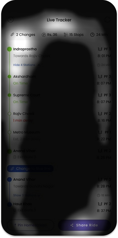
Once we identified the core problem of improving the route planning experience, we began by individually sketching out quick ideas to explore different directions. We used a Crazy 8s exercise to generate multiple concepts without fixating on a single solution too early. This helped us compare approaches, combine the strongest elements, and stay open to iteration before moving into digital wireframes.

3. Deliver (Implementation phase)
The design delivery phase was a self-initiated extension beyond the formal scope of my dissertation. I used the findings to explore potential solutions through rough wireframes and high-fidelity mockups. My goal was to design interventions that were more personalized, engaging, and emotionally supportive.


Metrics for Success: Aligning User Needs with Business Objectives
Retention rate ≠ Reduction in screen time: This seemed like the real challenge here.
Interventions like break reminders and time limits could potentially reduce time spent on the app, conflicting with business objectives focused on maximising user engagement. The goal is to promote mindful engagement and healthier digital habits. By promoting healthier usage patterns, Instagram can position itself as a responsible platform that values user well-being, leading to increased trust, loyalty, and long-term user retention.
#Long-term Goal
#Short-term Goal
Shifts in Usage Patterns
Encouraging quality interaction can satisfy user needs while still aligning with the business goals of keeping users active on the platform.
How to Measure
Use engagement metrics to track the quality
of interactions, such as time spent on valuable content (e.g., grabbing useful information, productive use) versus mindless scrolling, and analyze whether users are spending their time more intentionally.
Sustained Behavioural Change
Evaluate if users maintain healthier scrolling habits over time, indicating that the interventions are effective.
How to Measure
Compare pre- and post-intervention data to assess long-term shifts in user behaviour, such as more frequent breaks or reduced overall scrolling over a sustained period.
Finally, my top learnings...
Real-Time Data is Powerful, but Tricky
Exploring how to integrate live DMRC data made me realise the value and complexity of designing around real-time systems, especially for travel apps.
Scoping is Everything
Working with a vast system like the Delhi Metro taught me the importance of narrowing down broad challenges into focused, solvable problems especially under tight time constraints.
Designing with Constraints Builds Focus
A one-week timeline forced me to prioritise user needs and make fast, thoughtful decisions, sharpening my ability to balance quality with speed.